
There isn’t one universal winner, but multi step forms, conditional logic forms and short quick capture forms consistently deliver the highest conversions because they feel lighter, more personal and easier to complete.
Lead Forms
10 Best Lead Capture Forms for 2026 (And Why They Convert Better)
See 10 high-converting lead capture form examples used across industries and learn how to recreate them for your own funnel.
MakeForms Team . February 25, 2026 . 5 Mins Read

The lead capture form styles that convert best and how you can adapt them for your own funnel
Every business has had that moment when a visitor lands on a page, shows intent, starts filling a form and then quietly disappears. Not because they weren’t the right lead, but because the form didn’t guide them well enough. Lead capture forms work only when the structure feels simple, the value is clear and the flow matches how the user thinks.
In 2026, the best lead capture forms are not complicated. They are focused, intentional and tailored to the journey the visitor is already on. Whether it’s a SaaS demo request, a real estate inquiry or a healthcare intake, certain form styles consistently convert better because they remove friction and highlight value at the right moment.
This article breaks down the 10 best lead capture forms for 2026, why they outperform others, and how you can recreate each version to suit your own funnel without overthinking the design or structure.
Here’s what you can takeaway from this article:
- Which lead capture form styles consistently convert across different industries
- Why certain lead forms perform better than others
- How to recreate each form type on MakeForms in a simple, practical way
Which lead capture form styles consistently convert across industries
The forms that convert well usually follow a few reliable patterns. These patterns shape how the form behaves, how much information you ask for, and how you guide users from the first field to the final submit. When these elements work together, the form feels natural to complete rather than demanding or confusing.
Below are the four core lead capture form formats that consistently perform well across industries. Think of them as the foundations you can build on whether you are creating a real estate lead form, a demo request form, a gated content form, or something more advanced.
1. Short Single-Page (One-Column) Forms
Short single-page forms are built to collect basic details quickly without interrupting the user’s flow. They stay on one screen, use a clean single-column layout, and focus on speed over deep qualification.
This form type works best when intent is light and exploratory, and the goal is simply to start a conversation.
Common examples include:
- Contact forms for general inquiries
- Newsletter signups
- Simple callback or question forms
Because everything is visible at once and the number of fields is limited, these forms feel easy and low-pressure to complete. That simplicity is what makes single-page forms consistently effective at the top of the funnel.
2. Multi Step or Progressive Lead Forms
Multi-step lead forms split questions into short, focused sections so users never feel overwhelmed. Instead of facing a long list of fields, users move through the form one step at a time.
This format is ideal when you need more information but want the experience to stay light and structured.
Common examples include:
- SaaS demo request forms
- Consultation or discovery call requests
- Application or onboarding forms
By asking users to focus on one small decision at a time, multi-step forms feel easier to complete and often outperform long single-page forms in mid- and bottom-funnel scenarios.
3. Conditional Logic Lead Forms
Conditional logic lead forms change dynamically based on the user’s responses. Instead of showing the same questions to everyone, the form displays only what is relevant to that specific user. This keeps the experience shorter, more personal, and easier to move through.
Common examples include:
- Service selection forms that show different questions per service
- Consultation forms tailored by industry, role, or need
- Intake forms for healthcare, agencies, or advisors
Because users only see questions that apply to them, the form feels tailored rather than generic. This relevance reduces friction, speeds up completion, and improves the quality of information collected.
4. High Intent Demo or Consultation Forms
High-intent lead generation forms are used when users are ready to take a clear next step, such as booking a demo, requesting a quote, or scheduling a consultation. These forms prioritise clarity, trust, and focus.
Common examples include:
- B2B SaaS demo request forms
- Legal, financial, or healthcare consultation forms
- Enterprise sales inquiry forms
Because users already have strong intent, these forms convert best when expectations are clear and the experience feels professional. A focused layout and clear outcome help users complete the final step with confidence. These four formats form the backbone of almost every high converting lead capture form.
In the next section, we expand them into the ten core lead form types used across industries so you can see how these styles play out in real examples.
The 10 Lead Capture Form Types Used Across Industries
Now that we’ve looked at the four formats that shape how strong lead capture forms behave, it helps to see how they appear in real-world scenarios. Across industries, these are the ten form types that repeatedly show strong completion, clear intent and predictable conversion.
Each one serves a different purpose, but they all build on the same foundation: simple flow, clear value and a user friendly structure.
1. Demo Request Form
Short contact or demo request forms are one of the most simple but effective lead capture form formats.
Service businesses, SaaS teams, agencies, and consultants use them for general inquiries, demo requests, and sales callbacks where the objective is speed over qualification. By reducing fields to only what’s essential, these forms consistently increase submission volume and reduce drop-off, making them a high-ROI capture method.
Deel’s demo request form is a great example of high-intent lead capture done right.
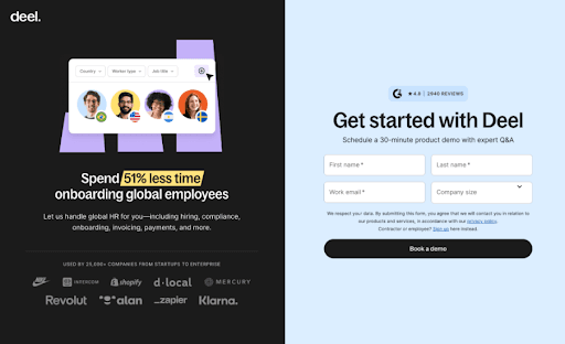
The two-column layout uses the left panel to build credibility through social proof, while the right panel collects only three critical inputs - full name, work email, and company size. This balance makes the form feel appropriately lightweight for a demo request, capturing essential qualification data without overwhelming the user.
You can replicate this quickly on MakeForms drag-and-drop form editor using features designed for exactly this kind of high-intent flow:
- Two column form layout
- Add images / videos into the form
- Upload your brand kit to match your branding
- Embed to your website using our full embed page
If you don’t feel like making a custom form from scratch, you can even try out our AI form generator here, or use a ready-to-edit template for lead forms here.
2. Quick Capture form with value exchange
Quick capture forms with a value exchange are built for speed. Instead of asking users to “contact us,” they offer an immediate benefit upfront, such as a discount, early access, or a small reward. This makes submitting the form feel like an easy win rather than a commitment.
You’ll see this form style used across local services, home services, marketplaces, and on-demand platforms. The effort is minimal, usually just an email or phone number, while the perceived value is clear and immediate. That imbalance is exactly why these forms convert so well.
TaskRabbit’s discount capture form is a great example.
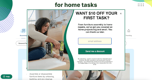
Instead of asking users to browse or sign up fully, it offers a clear incentive: a discount on the first task. The form collects only one essential input, the email address, and places it next to a strong value message. There’s no friction, no extra steps, and no confusion about what happens next.
You can recreate this form easily on MakeForms.
- Start with a Single-Page Lead Form or Quick Capture template
- Use a headline or microcopy block to highlight the offer, like “Get $10 off your first service”
- Add a single email or phone field with autofill enabled
- Customize the CTA text to reinforce the value, not the action
- Add a short reassurance line using a microcopy block
- Embed the form directly on your homepage or service page using the embed option
If you want to move faster, you can also generate this form using MakeForms’ AI form builder or duplicate it across campaigns by saving it as a template.
3. Conditional Logic Lead Forms for Agencies, Consulting and Professional Services
Conditional logic lead forms are built to handle complexity without overwhelming the user. The experience feels guided, relevant and far shorter than it actually is.
This form style is widely used by agencies, consulting firms, recruitment platforms, professional services marketplaces and B2B service providers. Any business offering multiple services, roles or engagement models benefits from asking different questions to different users.
The reason this format works is simple. Users only see questions that apply to their situation. That reduces cognitive load, speeds up completion and improves lead quality at the same time.
Toptal’s hiring form is simple and easy to follow.
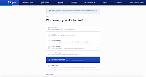
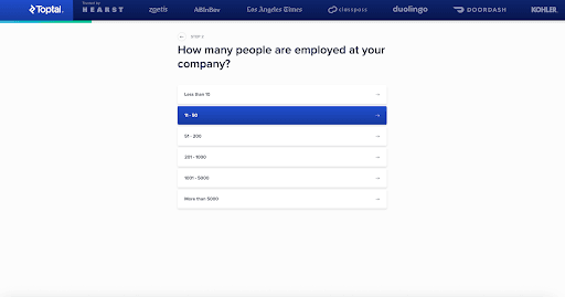
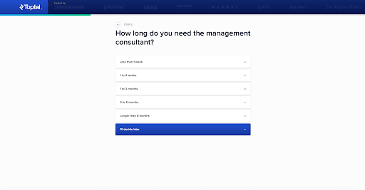
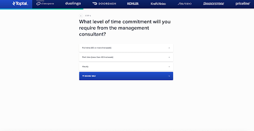
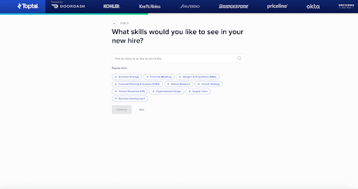
Toptal starts by asking who the client wants to hire. Based on that choice, the form dynamically changes. Company size, project duration, time commitment and required skills appear step by step, each informed by the previous answer.
By the time the form ends, Toptal has all the context needed to route the lead correctly, without the user ever feeling burdened.
MakeForms handles this kind of adaptive flow seamlessly. You can set up branching questions visually, reuse the same logic across different services.
- Start with a Service Inquiry or Consultation template
- Add a primary selector like “What service do you need?”
- Use the Logic Builder to show or hide follow-up questions based on selections
- Group related questions into steps so each screen stays focused
- Use choice cards or buttons instead of long dropdowns for faster decisions
- Preview each logic path instantly to make sure the flow feels natural
Or you can also generate an initial version with the AI form builder and fine-tune it as needed. The structure stays clear and flexible, even as the form adapts to each user’s choices.
4.High-Intent Consultation Forms for Legal, Healthcare, and Professional Services
High-intent consultation forms are designed for moments when someone is actively seeking help, not browsing. These forms appear when the user already has a problem and wants a clear next step, such as a case review, medical consultation, or expert advice. At this stage, clarity and trust matter far more than speed.
This form style is widely used across legal firms, healthcare providers, financial advisors, and other professional services where the outcome is sensitive or high value. Users are willing to share more information, but only if the form feels legitimate, secure, and worth their time.
Morgan & Morgan’s case evaluation form is a strong example of this done right.
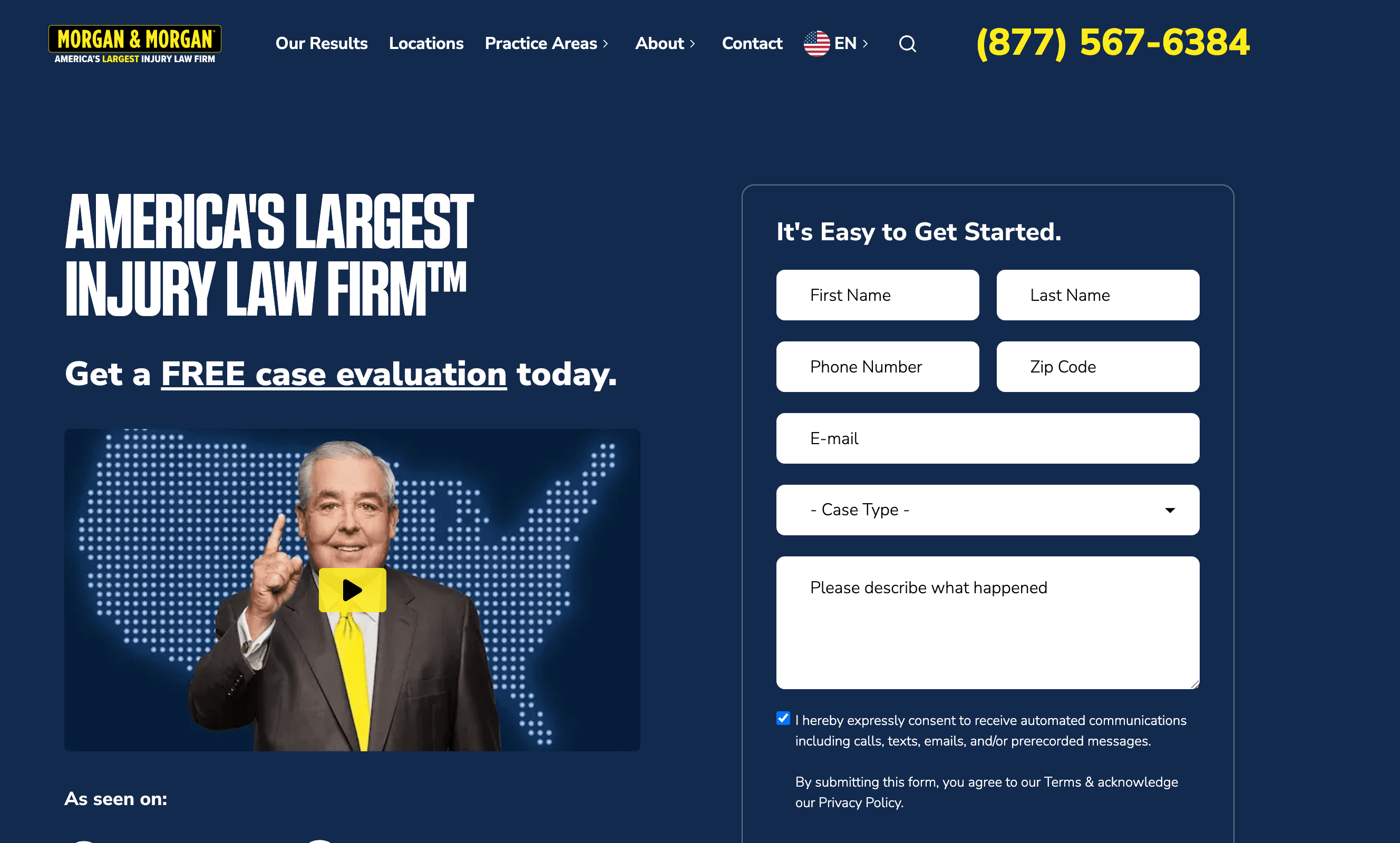
The form sets expectations immediately with a clear promise: a free case evaluation. It uses strong credibility signals like media logos and firm size to build trust before the user interacts with a single field. The layout stays calm and structured, collecting essential details step by step without rushing the user.
What makes this form effective is balance. It asks for enough information to assess the case properly, but the flow never feels aggressive. Each field feels purposeful, from contact details to case type and description. The user understands why the information is needed and what will happen next.
MakeForms supports this kind of high-intent consultation flow naturally.
- Start with a Consultation or Intake template - Gives you a structured foundation without building the form from scratch.
- Set expectations clearly at the top - Use headline and description fields to explain who the form is for and what happens next.
- Keep everything in a single-column layout - Maintains focus and makes longer forms easier to move through.
- Use dropdowns for case type or service category - Routes leads accurately without adding unnecessary follow-up questions.
- Add a long text field for context - Allows users to explain their situation in their own words, which is essential for legal and healthcare cases.
- Enable consent and compliance fields where required - Add TCPA, HIPAA, or legal disclaimer fields using built-in components.
- Reinforce next steps with microcopy under the CTA - Simple lines like “Our team will review your case within 24 hours” add clarity and trust.
If speed matters, the same structure can be generated using the AI form builder and refined visually. The result is a consultation form that feels calm, professional, and respectful of the user’s situation, exactly what high-intent leads expect.
5. Gated Content Download Forms for Marketing, SaaS, and B2B Research
Gated content forms are designed for moments when users want depth, not a sales pitch. These forms trade access to something valuable for minimal contact details, which makes them especially effective for mid-funnel audiences who are researching, comparing, or building a business case.
This format is widely used across B2B SaaS, enterprise technology, consulting, finance, and marketing teams. Whitepapers, analyst reports, industry benchmarks, and long-form guides are common use cases because the perceived value is high enough for users to pause and share their information.
Gartner offers a clear example of how gated content should work.
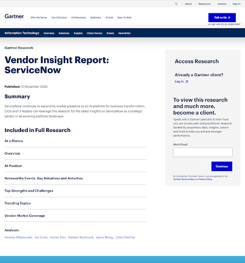
It uses a simple access gate placed directly alongside the research, making the value clear from the start: exclusive, proprietary insights. The form stays intentionally minimal, usually asking only for a work email before granting access.
The exchange feels fair and transparent. Users understand what they will receive, the effort feels proportionate to the value, and the next step is clear, which keeps friction low and completion rates high.
Recreate this gated content flow on MakeForms in less than a minute.
- Start with a Content Download or Lead Capture template for a ready-made structure
- Add a clear headline and short description explaining what the content covers
- Keep the form minimal, typically name and work email, in a single-column layout
- Enable light email validation to reduce mistakes without adding friction
- Deliver the content instantly on the thank-you screen or via automated email
- Add a reassurance line under the CTA, such as “No spam. Research access only.”
The result is a gated content form that feels focused, credible, and aligned with how B2B buyers expect to access high-value research.
6. Assessment or Calculator Lead Forms in Wellness and Healthcare
Assessment-style lead forms work especially well in wellness and healthcare because users are often looking for guidance, not a sales conversation. These forms frame the interaction as self-discovery. Instead of asking users to submit their details upfront, they begin by answering simple, personal questions about their goals or habits.
This format is effective because it creates momentum before any personal information is requested. Users stay engaged as the form progresses, and each step feels purposeful. By the time contact details are introduced, the user has already invested time and received perceived value, which makes completion feel natural rather than intrusive.
Healthline’s nutrition assessment begins with a simple goal-based question.
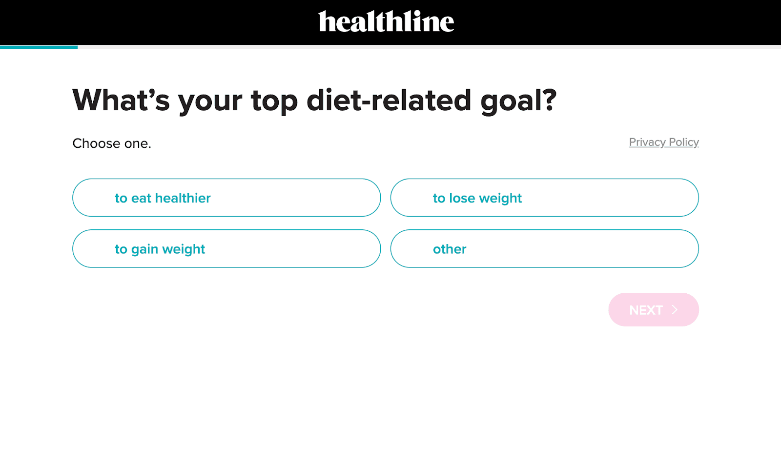
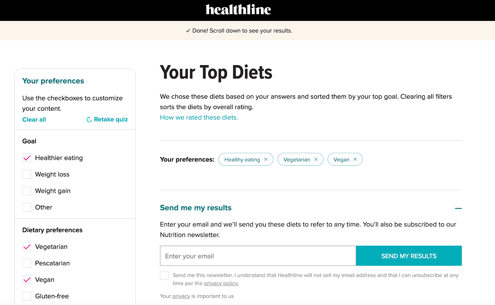
Users select an option using large, tap-friendly choice buttons. The flow adapts as they move forward, keeping each step focused and easy and the results feel personalised, not generic, which builds trust.
This format works because each screen asks only one question at a time, which keeps cognitive load low. Clear progress signals reassure users that the flow is short, and button-based choices let them respond faster than typing, especially on mobile.
With MakeForms, building an interactive assessment feels straightforward. The flow adapts naturally while staying quick and easy for users to complete.
- Start with a multi-step or assessment template.
- Use choice cards or buttons for faster decisions.
- Apply conditional logic so follow-up questions adapt to each answer.
- Add a results or summary screen before asking for email or phone.
- Use scoring or calculated fields to generate instant outcomes.
- Enable autosave and mobile preview to ensure a smooth experience across devices.
This format feels interactive, valuable and low pressure, which is why these lead forms consistently deliver high completion rates across multiple industries.
7. Appointment or Scheduling Lead Forms for Healthcare, Consulting and Professional Services
Appointment and scheduling lead forms work best when users want certainty, not conversation. At this stage, people are ready to take action. They are looking to book a visit, request a follow-up, or secure a specific time slot without unnecessary back and forth.
This form type is widely used across healthcare providers, clinics, consultants, financial advisors, legal firms and education services. Any business that relies on scheduled interactions benefits from giving users a clear, structured way to move forward.
Mayo Clinic’s appointment request flow shows how this works in practice.
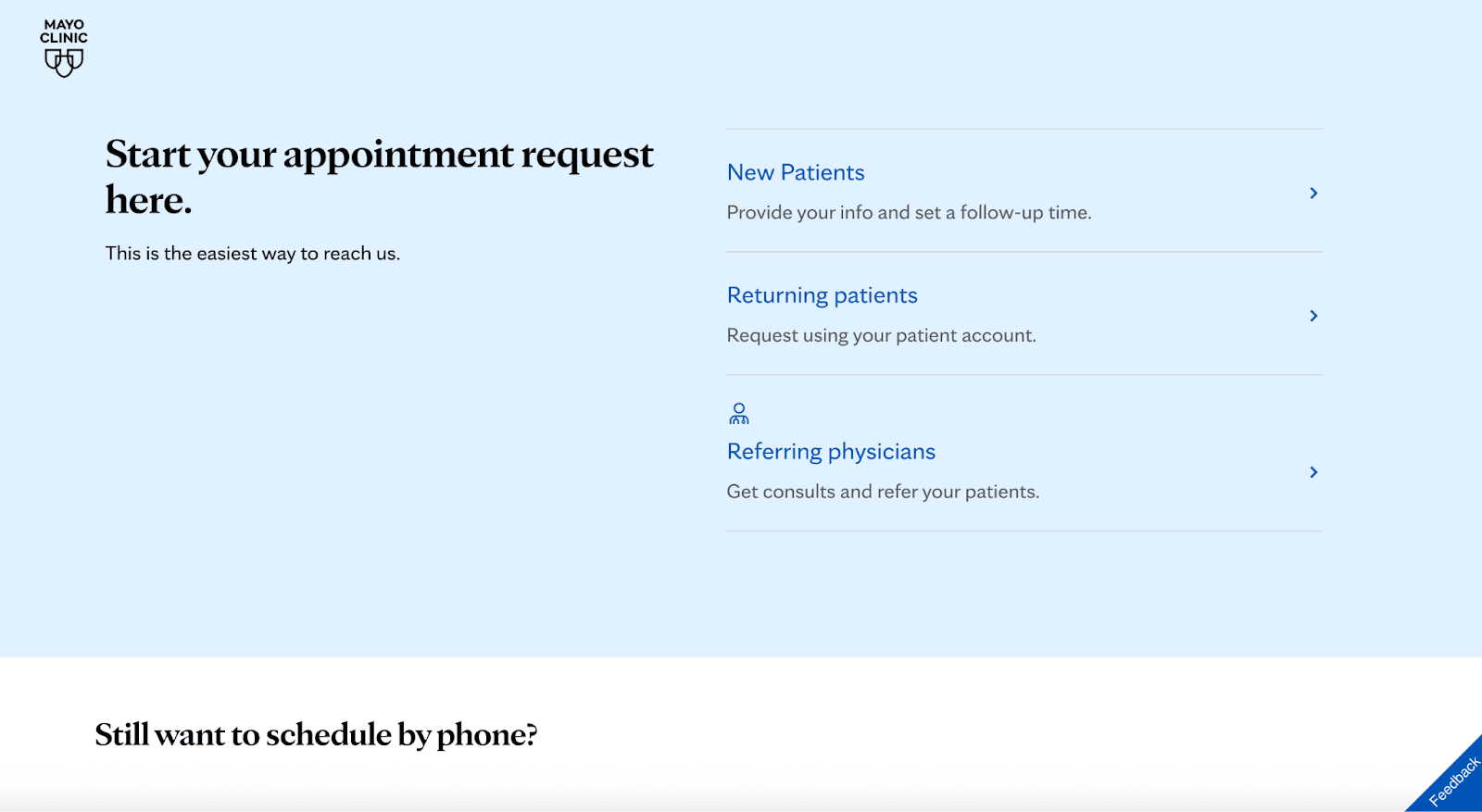
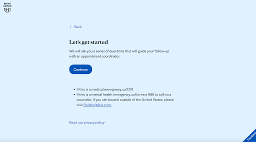
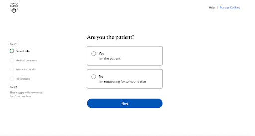
The experience begins by asking users who they are: new patients, returning patients, or referring physicians. Each selection leads to a tailored path, so the questions that follow always feel relevant. The form then progresses in calm, clearly labeled steps, covering patient details, medical concerns, insurance information, and preferences without overwhelming the user.
What makes this flow effective is its structure. The form feels intentional and respectful. Users know why they’re being asked each question and what will happen next. Clear progress indicators reduce uncertainty, and the clean layout builds trust at every step, which is critical in healthcare environments.
On MakeForms, this type of scheduling flow is straightforward to set up:
- Start with an Appointment or Intake template to get a structured foundation.
- Segment users early with a simple selector such as new patient, returning patient, or referral.
- Break the form into clear steps so each screen stays focused and easy to complete.
- Use conditional logic to show different questions based on patient type or service selected.
- Add date and time fields or preferred follow-up options for scheduling clarity.
- Enable compliance and consent fields when required for healthcare or regulated services.
- Use microcopy to explain next steps, such as when someone will reach out or how the appointment will be confirmed.
The result is a scheduling form that feels calm, guided, and trustworthy. It respects the user’s situation while collecting the details your team needs to follow up efficiently, which is exactly why this format continues to convert well across healthcare and professional service industries.
8. Embedded Landing Page Lead Forms for SaaS, Agencies and Enterprise Sales
Embedded landing page lead forms are built to capture interest at the exact moment a user is evaluating a solution. Instead of sending visitors to a separate contact page, the form lives directly within the page content, so the experience feels seamless and intentional.
This format is commonly used by SaaS platforms, agencies, marketplaces, and enterprise software companies where the goal is to turn high-intent visitors into sales conversations. Pricing pages, product comparison pages, migration pages, and enterprise solution pages are where these forms perform best.
Because the user is already reading about features, benefits, and use cases, placing the form alongside that information keeps momentum high. The form feels like a natural continuation of the page rather than a new step, which reduces hesitation and improves completion.
Shopify’s “Get in touch with an expert” flow is a clear example of this approach done well.
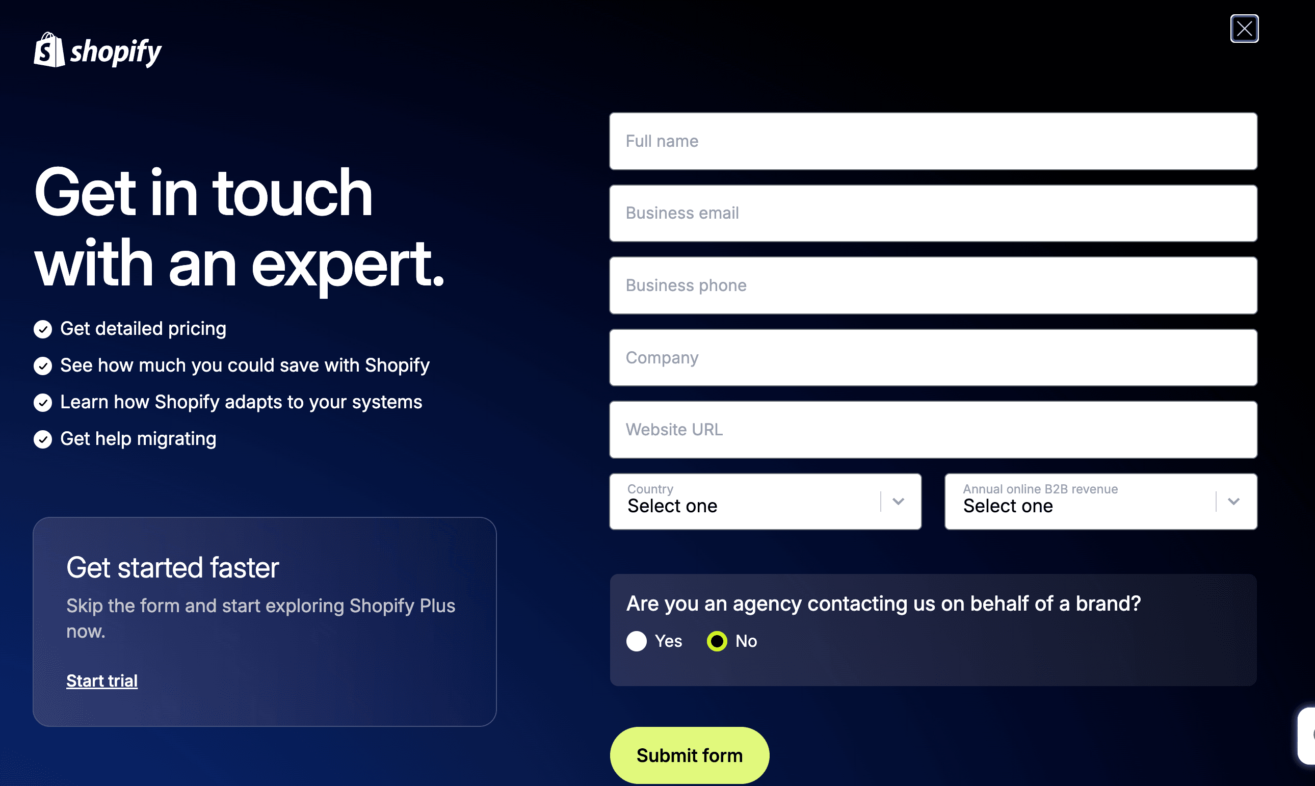
The form is embedded directly within a high-intent landing experience, not tucked away behind a generic contact link. The messaging, value points, and form fields are visually aligned, so users stay oriented and focused.
Leads are captured right when intent peaks, whether someone is exploring pricing, migration support, or scaling options. The layout balances persuasion on one side and action on the other, keeping attention anchored and guiding users forward without distraction.
This is how embedded landing page forms are meant to work. Everything stays in one place, friction drops, and users move from interest to action without breaking flow.
You can build this same embedded experience cleanly on MakeForms:
- Start with a Lead Capture or Consultation template to get a conversion-ready structure.
- Embed the form directly into your landing page using the native embed code.
- Place the form next to value-driven copy so users understand the benefit before they submit.
- Use a single-column layout to keep scanning easy, even with more fields.
- Add dropdowns or conditional fields for qualification without overwhelming the user.
- Enable autofill and light validation to keep the experience fast and smooth.
- Match the form design to your brand so it feels like part of the page, not an add-on.
This setup turns high-intent landing pages into consistent lead generators while keeping the experience focused, relevant, and easy to complete.
9. Onboarding request Forms for B2B, Healthcare, Legal and High-Value Services
Onboarding requests or Long-form qualification forms are designed for situations where lead quality matters more than lead volume. These forms intentionally collect detailed information upfront so teams can assess fit, scope, and readiness before investing time in follow-ups.
This format is common across B2B SaaS, enterprise services, consulting, healthcare providers, legal firms, and onboarding-heavy products. Any business offering complex, high-value, or customized services benefits from understanding the lead’s context early, such as company size, use case, budget range, or operational maturity.
The reason this form style works is trust and intent alignment. Users who complete longer forms are already motivated. By asking meaningful questions upfront, businesses filter out low-intent inquiries, reduce sales friction later, and route leads to the right team with the right expectations.
HubSpot’s onboarding request form shows how long-form qualification works when the service requires deeper context upfront.
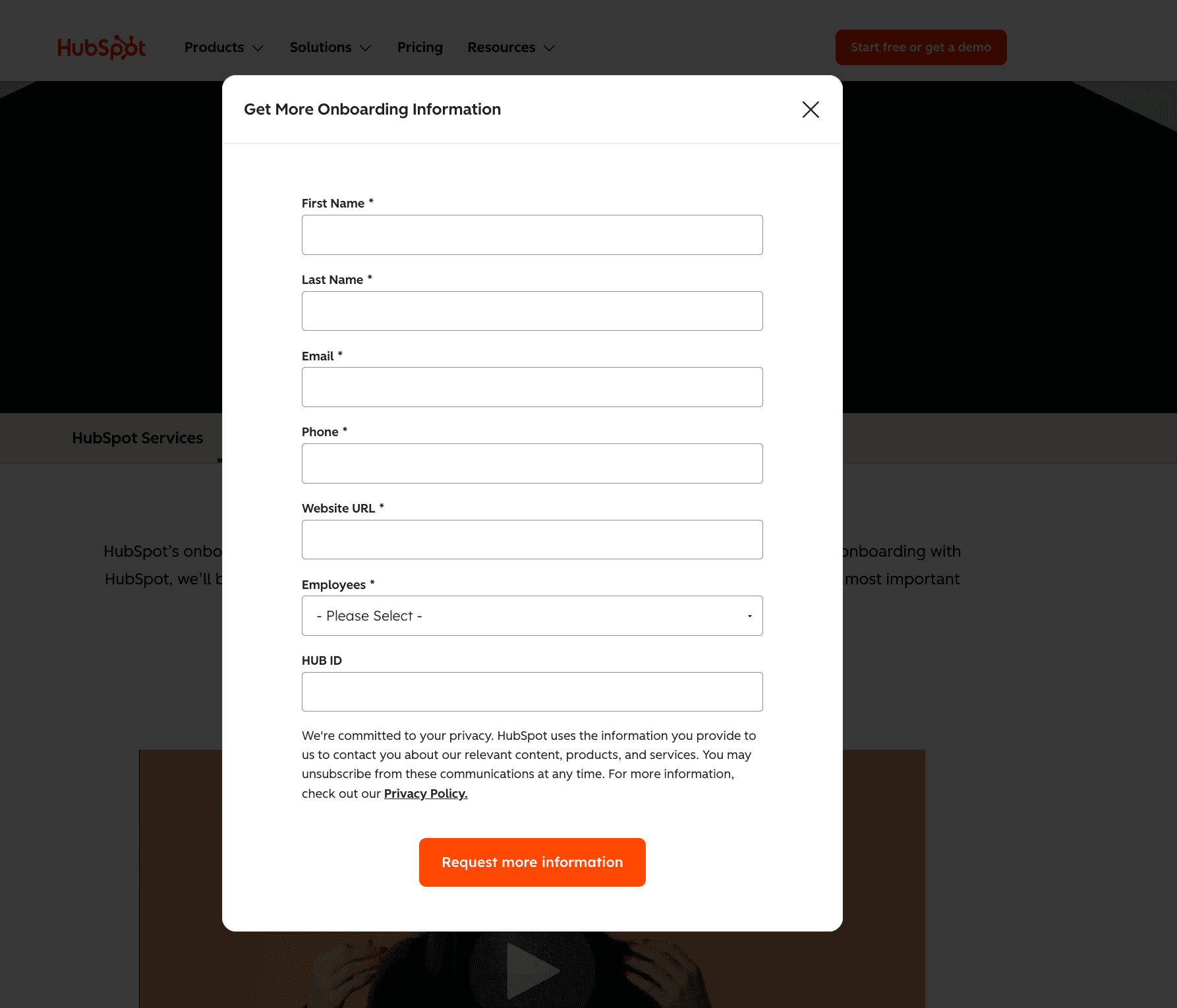
The form clearly signals that it’s meant for serious inquiries by asking for company details, employee count, website, and contact information in one focused flow. There’s no attempt to make it feel “quick.” Instead, the structure communicates that onboarding is a tailored service, not a one-click action. That framing sets the right expectations and attracts leads who are ready to engage.
This type of qualification flow is straightforward to build on MakeForms:
- Start with a Consultation or Onboarding template to establish structure from the beginning
- Group related fields into logical sections so the form feels organized, not overwhelming
- Use dropdowns for employee size, use case, or service tier to standardize responses
- Add optional context fields where users can explain goals or constraints
- Include consent, privacy, and compliance fields where required
- Keep the layout clean and single-column so longer forms remain readable
The result is a qualification form that feels intentional and professional. Users understand why the questions are being asked, and teams receive leads that are informed, relevant, and far more likely to convert.
10. Real Estate Inquiry Forms for Property Buyers and Renters
Real estate inquiry forms are designed to start a conversation, not complete a transaction. Buyers and renters often have questions, preferences, or timelines that aren’t fully defined yet, so the form needs to feel open, simple, and approachable.
This form style is commonly used by real estate brokerages, luxury property firms, rental platforms, and independent agents. The goal is to capture intent early while making it easy for someone to reach out without pressure.
Engel & Völkers inquiry form shows how simple, well-structured forms work best for real estate leads.
It focuses on essential contact details and leaves space for an open message, allowing prospects to explain what they’re looking for in their own words. The layout is clean, the language is conversational, and the form doesn’t over-qualify too early. That balance makes it easy to start the conversation while still giving agents useful context.
This works because it respects how people make property decisions. Users aren’t forced into rigid options. They can share interest, ask questions, or signal seriousness at their own pace, which increases submissions and improves follow-up quality.
MakeForms makes it simple to replicate this kind of inquiry flow without starting from scratch.
- Start with a Contact or Property Inquiry template for a simple base.
- Use a short headline to set expectations, not pressure.
- Keep fields limited to name, phone, email, and message.
- Add a long text field so prospects can describe their needs freely.
- Include consent or contact permission fields where required.
- Embed the form directly on listing or agent pages for maximum relevance.
The result is a real estate inquiry form that feels personal, low-friction, and ready for meaningful follow-ups.
The Forms That Convert and the Tool That Helps You Build Them
Lead capture forms convert best when they feel natural to complete, respect the user’s time and offer clarity exactly when the user needs it. Whether it is a quick contact form, a multi step SaaS demo flow or an interactive calculator that delivers instant value, the forms that perform best in 2026 are the ones that guide the user with ease and confidence.
The ten form types in this guide give you a proven foundation across industries. What truly elevates them is how easily you can bring each one to life. That is where MakeForms changes the experience entirely. It gives you templates, conditional logic, scoring, OTP verification, built in compliance, branding control and mobile optimisation in one simple platform. You can recreate any form style in minutes, personalise the flow for different funnel stages and maintain a smooth, consistent experience for every visitor without writing a single line of code.
MakeForms gives you everything you need to build lead capture forms that feel modern, fast and trustworthy from the very first field to the final submit.
Build smarter, high converting lead capture forms with MakeForms. Start your free trial